Scatter and Bubble Charts
Scatter Plot - Bubble Plot
Scatter plots & bubble plots are useful to compare (or filter) two dimensions: these dimensions can be
- measures, like Open % and CTO %,…
- or hierarchies like day of the week or hour of day,...
When to use:
- Scatterplots are useful when looking for relationships between 2 measures, like comparing campaigns / user groups over the open % and CTO %
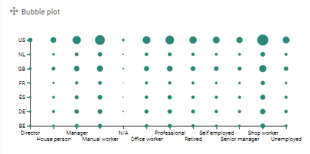
- Bubble plots allow you to compare values across 2 dimensions, these can be hierarchies or measures.
-
